Volvo Maintenance Center
Brazil(Remote), Full Time
Tools & Stack used
Figma, Jira, Analytics, NPS
Project Summary
In this project, I was the assigned UI/UX Designer responsible for designing a comprehensive maintenance report platform for Volvo. This platform was intended to be used by technicians and service teams across Brazil, providing a unified tool for documenting, analyzing, and managing vehicle maintenance reports.
The Challenge
Before the development of the new Volvo Maintenance Report Platform, the existing maintenance scheduling portal was outdated and in serious need of an upgrade. The platform struggled with several key issues that hindered its effectiveness and usability.
Outdated Styling: The visual design of the old platform was outdated, making it difficult for users to navigate and interact with the system efficiently. The interface lacked modern design principles, which contributed to a less intuitive user experience.
Accessibility Concerns: The platform did not meet current accessibility standards, creating challenges for users with disabilities. This was a significant issue, as it limited the platform’s usability and prevented certain users from effectively engaging with the system.
Poor User Experience: The general user experience of the platform was lacking, with complex workflows, unclear navigation, and a lack of user-centric design. This resulted in frustration for users, who found it difficult to complete tasks efficiently and effectively.
The need for a comprehensive redesign was clear, and the Volvo project aimed to address these issues by creating a modern, accessible, and user-friendly maintenance report platform that could be used seamlessly across Brazil.
Goals
The primary goal of the Volvo Maintenance Report Platform project was to completely redesign the existing platform with a comprehensive approach to UX, ensuring that it met the needs of users across Brazil. To achieve this, we focused on several key objectives:
User and Competitor Research: We began by conducting thorough user research to understand the specific needs, pain points, and expectations of the platform’s users. Additionally, we performed competitor analysis to identify industry best practices and innovative features that could be incorporated into the new design. This research was crucial in shaping the direction of the redesign and ensuring that the new platform would offer the best possible experience for its users.
Comprehensive UX Redesign: With insights from our research, we set out to redesign the platform with a user-centric approach. This involved rethinking the entire user experience, from navigation and workflows to the visual design and interaction patterns. Our goal was to create a platform that was not only functional but also intuitive and enjoyable to use.
Clear and Intuitive UI for Large Data Sets: Given the nature of the project, which required managing and presenting large sets of data, one of our key challenges was ensuring that the UI remained clear and comprehensible. We focused on designing a clean, organized interface that made it easy for users to navigate and interpret complex data, reducing the cognitive load and enhancing overall usability.
Development
The Main Page
We began the development of the Volvo Maintenance Report Platform by focusing on the main page, which was a crucial entry point for users. The original design featured pages filled with tables and numbers, making it difficult for users to quickly find the information they needed. To address this, we introduced a more user-friendly approach centered around the use of cards.
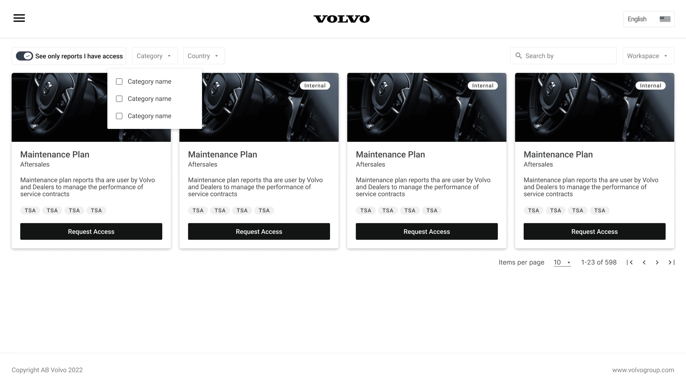
Card-Based Interface: Instead of overwhelming users with dense tables, we redesigned the main page to feature a card-based interface. Each card represented a key piece of information or a critical action, allowing users to access essential data at a glance. This not only made the interface more visually appealing but also significantly improved usability by simplifying the user’s interaction with the platform.
Enhanced Search and Filter Capabilities: To further streamline the user experience, we incorporated advanced search bars and filtering options. These tools allowed users to quickly locate specific data or reports without having to sift through endless pages of information. The filters were designed to be intuitive and powerful, enabling users to refine their searches with ease and precision.
By prioritizing ease of access and reducing the complexity of data presentation, the redesigned main page set the foundation for a much more efficient and user-friendly platform. This approach was instrumental in enhancing the overall user experience and ensuring that the platform could handle large amounts of data without overwhelming the user.
Navigation
One of the significant challenges with the old Volvo Maintenance Report Platform was its outdated and cumbersome hyperlink-based menu. Users often struggled to navigate the platform, as they had to sift through various functions buried in a disorganized menu structure. This not only slowed down their workflow but also created frustration and inefficiency.
To resolve these issues, we completely redesigned the navigation system, introducing a modern and intuitive sidebar menu.
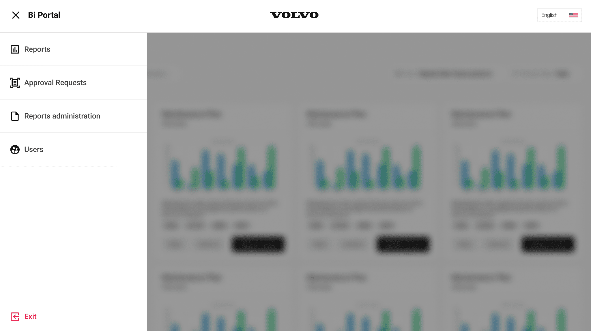
Easy Access with Sidebar Navigation: The new sidebar menu provided users with streamlined access to all features of the platform. Instead of relying on a maze of hyperlinks, users could now easily find what they needed through a well-organized, collapsible menu that grouped related functions together. This design made it much simpler to navigate the platform and quickly access essential tools and information.
Improved User Workflow: By placing all the core features and functions in a centralized location, the sidebar menu significantly improved the user workflow. Users could now seamlessly switch between different sections of the platform without losing their place or having to backtrack through multiple pages.
Consistent and Familiar Design: The sidebar was designed with consistency in mind, ensuring that it remained visible and accessible throughout the platform. This created a familiar and predictable navigation experience, allowing users to focus more on their tasks and less on figuring out where to find the tools they needed.
Easy Access Request
Previously, the process for users to request access to specific maintenance reports was cumbersome and inefficient. Users had to manually send an email to the platform administrator, requesting permission to view certain reports. This not only created delays but also added unnecessary administrative overhead, complicating the overall user experience.
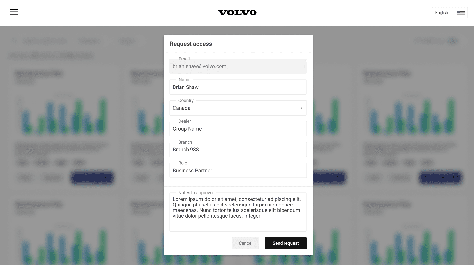
To streamline this process, we introduced the Easy Access Request feature directly within the platform.
Direct Access Requests: With the new Easy Access Request feature, users could now submit access requests directly through the platform. This eliminated the need to send separate emails or wait for administrative approval outside of the platform. Instead, users could simply click a button, fill out a brief form, and submit their request instantly.
Streamlined Approval Workflow: The platform automatically routed these requests to the appropriate administrator for review and approval, ensuring a faster and more efficient process. Administrators could then approve or deny requests directly within the platform, with all necessary information readily available.
Improved User Experience: This feature greatly improved the user experience by reducing the time and effort required to gain access to necessary reports. It also made the process more transparent, as users could easily track the status of their requests within the platform, eliminating uncertainty and reducing the need for follow-up inquiries.
Easy Access Approval
To further improve the efficiency of the access request process, we also focused on simplifying the administrator’s role in managing these requests.
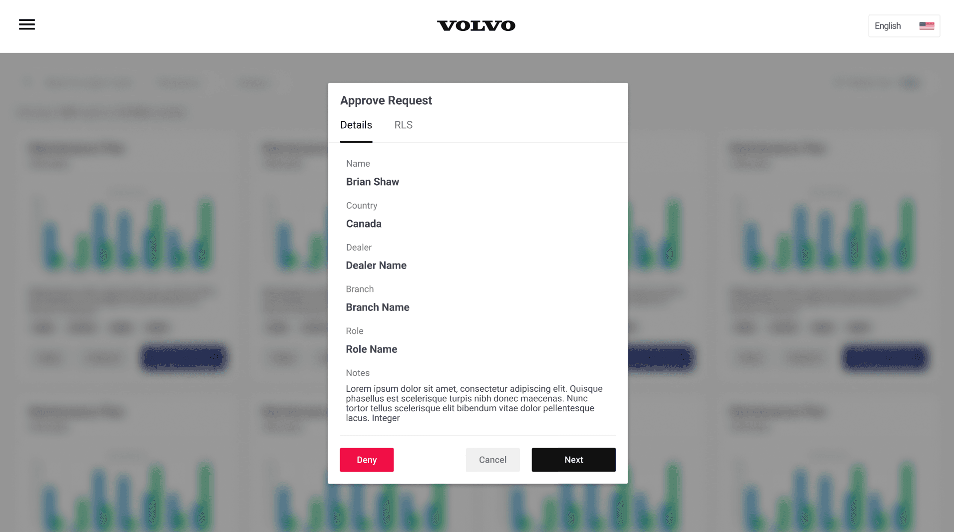
Administrator Access Management: With the redesigned platform, administrators could now manage access requests directly through their admin accounts. This allowed them to review, approve, or deny requests entirely within the platform, without needing to rely on external tools or processes.
Streamlined Approval Process: The administrator’s workflow was streamlined, enabling them to grant access with just a single click. Once a user submitted an access request, the administrator could quickly review the request, verify the necessary details, and approve it directly on the platform. This eliminated the back-and-forth communication previously required and ensured that users received timely access to the reports they needed.
Complete In-Platform Workflow: By bringing the entire request and approval process inside the platform, we created a seamless and integrated experience for both users and administrators. This not only reduced the time and effort involved in managing access but also improved the overall efficiency and responsiveness of the system.
The enhancements to the Easy Access Request feature made the process of managing and granting report access faster, more transparent, and entirely self-contained within the platform. This was a crucial improvement that contributed to a smoother and more user-friendly experience for everyone involved.
Design System Usage
To ensure consistency and alignment with Volvo’s brand identity, we leveraged the Volvo Design System throughout the development of the Maintenance Report Platform. The design system provided a comprehensive set of guidelines, components, and patterns that we used to create a cohesive user experience.
Results
The launch of the redesigned Volvo Maintenance Report Platform was met with overwhelmingly positive feedback. The new platform significantly improved the user experience, leading to a noticeable increase in user satisfaction.
Enhanced User Satisfaction: Users appreciated the streamlined navigation, intuitive design, and the ease of accessing essential features. The card-based interface, easy-to-use sidebar menu, and the integrated Easy Access Request feature made the platform much more user-friendly. As a result, user satisfaction rose considerably, reflecting the success of the redesign in addressing the pain points of the old platform.
More Efficient Processes: The platform’s new features, such as the streamlined access request process and the clear, intuitive UI, made it easier for users to complete their tasks without unnecessary delays or complications. This efficiency translated into a more productive and pleasant user experience, further contributing to the positive reception of the platform.
Overall, the redesigned Volvo Maintenance Report Platform delivered a more accessible, efficient, and satisfying experience for users across Brazil, fulfilling the project’s goals and setting a new standard for Volvo’s digital products.
*This is just a brief overview of the project. If you’d like to dive deeper into the details or discuss my work further, I’d be happy to schedule a chat. Feel free to reach out!